You know those designs that instantly feel effortless? Where everything seems exactly where it should be — no squinting, no second-guessing, no rage-clicking?
That isn’t luck. It’s psychology.
Great UI design isn’t just about colors and fonts. It works because it understands how people think, what they notice, what they ignore, and what quietly frustrates them. Let’s dive into the psychology principles that make interfaces intuitive and delightful.
1. Cognitive Load: The Brain Is a Lazy Genius
Our brains are powerful but also energy-saving machines. The more effort your design requires, the faster users will quit — and maybe leave a frustrated review on the way out.
Good design isn’t about showing how clever you are. It’s about making users feel smart.
✅Tips:
Keep one main action per screen.
Remove unnecessary decisions — this isn’t a quiz show.
Hide advanced complexity until users actually need it.
2. Hick’s Law: Too Many Choices = Slow Decisions
The more options you offer, the longer it takes to choose. Think of dropdowns with 200 items starting with “Afghanistan.”
✅Design for clarity, not overload:
Break big tasks into small steps.
Highlight recommended or most common options.
Use sensible defaults — most people stick with them.
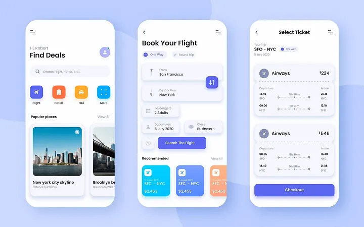
3. Fitts’ Law: Targets Must Be Easy to Hit
Tiny buttons and minuscule “X” icons? A nightmare.
Fitts’ Law says the time to click depends on size and distance. If you want action, make targets obvious and tappable.
Practical ideas:
Enlarge touch areas on mobile.
Place main buttons where thumbs naturally rest.
Separate destructive actions to prevent mis-taps.
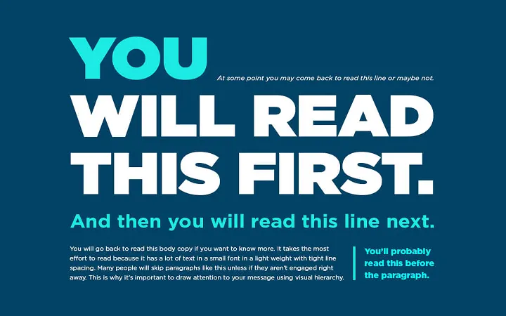
4. Visual Hierarchy: Guiding the Eye
Users don’t read. They scan — like squirrels on caffeine.
Your job? Direct their attention. Use size, color, spacing, and contrast to make the important parts scream “Start here.”
Quick test: Squint at your design. What stands out? That’s your true focal point.
5. Familiarity Beats Creativity
Innovation is tempting, but reinventing the navigation bar or login form usually backfires. People trust familiar patterns because they reduce friction.
✅Rule of thumb:
Stick to standards for critical flows (signup, checkout).
Save creativity for microinteractions and visuals.
Remember: familiar = safe. Unusual = suspicious.
6. Gestalt Psychology: Grouping for Meaning
Humans naturally group things by proximity, similarity, and alignment. If your design ignores these rules, users get confused fast.
People make decisions emotionally, then justify logically. Your UI should spark feelings of confidence and delight.
How to design for emotion:
Add microcopy with personality.
Use smooth, subtle animations (not explosions).
Add “wow” moments — confetti on success, friendly loading states.
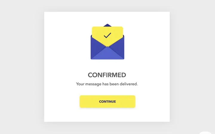
8. Peak-End Rule: What Users Remember
Users don’t remember every click. They recall peak moments and the ending.
Design accordingly:
Identify your peak moments (e.g., checkout) and make them magical.
Don’t neglect the finale — thank-you screens and confirmations matter.
9. Kill Uncertainty
Unclear actions cause hesitation. And hesitation kills flow.
Combat uncertainty with:
Labels like “Save Draft” instead of vague “Submit.”
Microcopy that reassures.
Feedback showing what just happened and what’s next.
10. Tools That Keep You Sane
Sometimes you don’t have time to reinvent the wheel. Plugins like Made in Figma provide pre-built flows that follow best practices — saving you hours and sparing your caffeine-fueled brain.